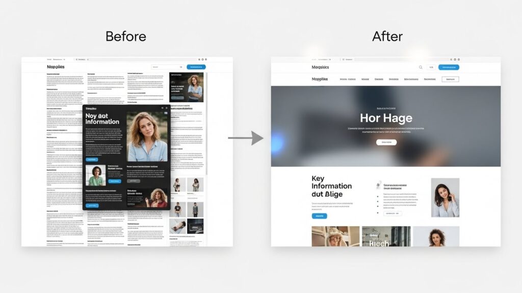
Many homepages try to do too much at once. They introduce every service, tell your entire story, and sprinkle in every possible call-to-action “just in case.” The result? Overwhelm—for your visitors and for you.
If your homepage says everything, your brain has to decide everything. Every time you want to update the site, you’re deciding what to add, where to add it, and how not to break what’s already there. That accumulated decision load is exhausting.
A clear homepage is more like a well-marked trailhead than a theme park map. Its job is to:
-
Clearly state who you help and what you help them with.
-
Offer one or two obvious next steps.
-
Give a sense of your tone and values, without telling your entire life story.
For most small service-based businesses, a simple structure works best:
-
A short, clear headline that names your audience and main outcome.
-
A brief paragraph that explains how you help.
-
A primary button (e.g., “Work with me,” “View services,” or “Book a consult”).
-
A few quick snapshots of services, results, or testimonials.
Everything else can live on secondary pages. Your homepage doesn’t have to carry everything alone.
AI can help you simplify without flattening your personality. You can paste in your current homepage text and ask for:
-
A one-sentence summary of what you do.
-
A short headline and subheading aimed at your specific audience.
-
Suggestions for what to move to separate pages.
Once your homepage is refocused, updates become easier. You’re not rewriting an essay every time; you’re making small adjustments inside a clear frame. That reduces decision fatigue for you and gives visitors a calmer, more confident experience.
When people land on a focused homepage, they don’t have to work as hard to figure out whether you’re for them. And you don’t have to work as hard to maintain it.